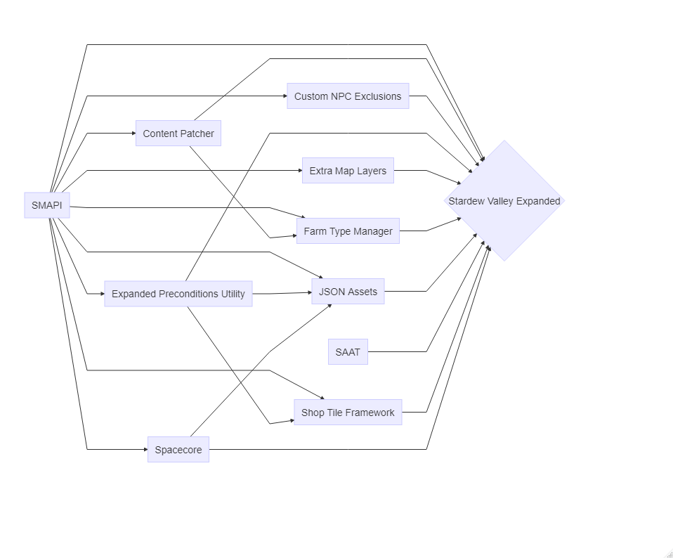
Stardew Valley Expanded
Now that I finally have some free time, I want to play the Stardew Valley Expanded mod. But first, let us make a flow chart of the mods and their dependencies. library("DiagrammeR") my_plot <- DiagrammeR::mermaid(" graph LR SMAPI[SMAPI] Content_Patcher[Content Patcher] Custom_NPC_Exclusions[Custom NPC Exclusions] Expanded_Preconditions_Utility[Expanded Preconditions Utility] Extra_Map_Layers[Extra Map Layers] Farm_Type_Manager[Farm Type Manager] JSON_Assets[JSON Assets] SAAT[SAAT] Shop_Tile_Framework[Shop Tile Framework] Spacecore[Spacecore] Stardew_Valley_Expanded{Stardew Valley Expanded} SMAPI --> Content_Patcher SMAPI --> Custom_NPC_Exclusions SMAPI --> Expanded_Preconditions_Utility SMAPI --> Extra_Map_Layers SMAPI --> Farm_Type_Manager SMAPI --> JSON_Assets SMAPI --> Shop_Tile_Framework SMAPI --> Spacecore Content_Patcher --> Farm_Type_Manager Expanded_Preconditions_Utility --> JSON_Assets Expanded_Preconditions_Utility --> Shop_Tile_Framework Spacecore --> JSON_Assets SMAPI --> Stardew_Valley_Expanded Content_Patcher --> Stardew_Valley_Expanded Custom_NPC_Exclusions --> Stardew_Valley_Expanded Expanded_Preconditions_Utility --> Stardew_Valley_Expanded Extra_Map_Layers --> Stardew_Valley_Expanded Farm_Type_Manager --> Stardew_Valley_Expanded JSON_Assets --> Stardew_Valley_Expanded SAAT --> Stardew_Valley_Expanded Shop_Tile_Framework --> Stardew_Valley_Expanded Spacecore --> Stardew_Valley_Expanded ")