Gauges
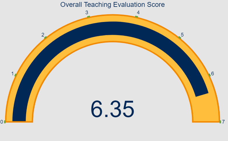
Gauges are useful when wanting to display a quantity along with its range (minimum and maximum). Here, we will try out the plotly package’s functionality to build a gauge plot. library("plotly") library("tidyverse") # https://plotly.com/r/gauge-charts/ # https://marketing.ucmerced.edu/resources/brand-guidelines/colors my_gauge <- plot_ly( domain = list(x = c(0, 1), y = c(0, 1)), value = 6.35, title = list(text = "Overall Teaching Evaluation Score", color = "#002856", font = list(size = 24)), type = "indicator", mode = "gauge+number", gauge = list( axis = list(range = list(NULL, 7.