| June 7, 2022
“The data this week comes from Data For Progress.
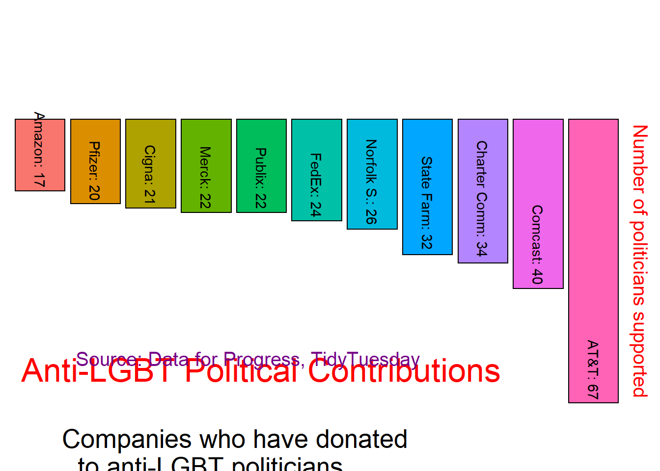
“Each year, hundreds of corporations around the country participate in Pride, an annual celebration of the LGBTQ+ community’s history and progress. They present themselves as LGBTQ+ allies, but new research from Data for Progress finds that in between their yearly parade appearances, dozens of these corporations are giving to state politicians behind some of the most bigoted and harmful policies in over a decade.
“Activists and allies wishing to hold these politicians accountable for bigotry can begin by holding their corporate backers accountable. In a new project series, Data for Progress has compiled a set of resources for activists, employees, community leaders, and lawmakers to push back on these policies and the prejudice powering them. We provide research tying the political giving of specific Fortune 500 companies to anti-LGBTQ+ politicians in six states, polling showing that such giving hurts the brands’ favorability, and upcoming policy memos to understand the issue and to take action.”
df <- readr::read_csv('https://raw.githubusercontent.com/rfordatascience/tidytuesday/master/data/2022/2022-06-07/fortune_aggregates.csv',
                      name_repair = janitor::make_clean_names) |>
  filter(company != "Grand Total") |>
  arrange(desc(number_of_politicians_contributed_to))
## Rows: 117 Columns: 4
## ── Column specification ────────────────────────────────────────────────────────
## Delimiter: ","
## chr (1): company
## dbl (3): total_contributed, number_of_politicians_contributed_to, number_of_...
##
## ℹ Use `spec()` to retrieve the full column specification for this data.
## ℹ Specify the column types or set `show_col_types = FALSE` to quiet this message.# colors via https://twitter.com/dataandme/status/1531946768270860288
pride <- c('#E50000','#FF8D00','#FFEE00','#028121','#004CFF','#760088','#000000','#613915','#73D7EE','#FFAFC7','#FFFFFF'
)
# label text colors
label_text_colors <- c(rep("black", 3),
rep("white", 5),
rep("black", 3))
label_text_colors <- rep("black", 11)df2 <- df |>
rename(amt_politicians = number_of_politicians_contributed_to) |>
select(company, amt_politicians) |>
top_n(length(pride)) |>
# sort company names by the number of politicians supported
mutate(company_ranked = forcats::fct_reorder(company, amt_politicians))## Selecting by amt_politicians# rename longer company names for brevity
df2$company[df2$company == "Publix Super Markets"] <- "Publix"
df2$company[df2$company == "Charter Communications"] <- "Charter Comm"
df2$company[df2$company == "Norfolk Southern"] <- "Norfolk S."my_plot <- df2 |>
# put together company names and number of politicians
mutate(for_label = paste0(company, ": ", amt_politicians)) |>
# make plot
ggplot() +
geom_bar(aes(x = company_ranked,
y = -1.0*amt_politicians,
fill = company_ranked),
color = "black", #to emphasize the white hue,
stat = "identity") +
# scale_fill_manual(values = rev(pride)) +
scale_y_continuous(position = "right") +
geom_text(aes(x = company_ranked, y = -1.0*amt_politicians,
label = for_label),
angle = -90,
color = rev(label_text_colors),
hjust = 1.05) +
labs(title = "Anti-LGBT Political Contributions",
subtitle = "Companies who have donated\nto anti-LGBT politicians",
caption = "Source: Data for Progress, TidyTuesday",
x = "",
y = "Number of politicians supported",) +
theme(axis.text = element_blank(),
axis.ticks = element_blank(),
axis.title.y = element_text(size = 15, color = "red"),
legend.position = "none",
panel.background = element_blank(),
plot.title = element_text(color = "red",
size = 25,
hjust = 0.1, vjust = -50),
plot.subtitle = element_text(color = "black",
size = 20,
hjust = 0.2, vjust = -70),
plot.caption = element_text(color = "#760088",
size = 15,
hjust = 0.25, vjust = 25))print(my_plot)