ggplot

Kruskal-Wallis Test

I want to mentally prepare for the upcoming semester. Today, let me do a warm-up exercise of computing a Kruskal-Wallis test. library("palmerpenguins") library("tidyverse") You can see that I will use the ubiquitous Palmer Penguins data set str(penguins) ## tibble [344 × 8] (S3: tbl_df/tbl/data.frame) ## $ species : Factor w/ 3 levels "Adelie","Chinstrap",..: 1 1 1 1 1 1 1 1 1 1 ... ## $ island : Factor w/ 3 levels "Biscoe","Dream",.

Continue reading

Ridge Plots

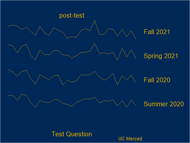
library("ggridges") library("patchwork") library("tidyverse") # load data df <- readr::read_csv("BioSQuaRE_data.csv") # wrangling df$term <- factor(df$term, levels = c("Summer 2020","Fall 2020", "Spring 2021", "Fall 2021")) df_pre <- df |> filter(iter == "pre-test") df_post <- df |> filter(iter == "post-test") plot_pre <- df_pre |> ggplot(aes(x = Item, y = term, height = UCMer, group = term)) + geom_ridgeline(color = "#DAA900", fill = "#002856") + labs(title = "BioSQuaRE Results", subtitle = "pre-test", caption = "", x = "Test Question", y = "") + theme( axis.

Continue reading

Pascal's Triangle

Once again, I find that I have been nerd sniped (inspired by Mathigon). Today, I want to plot (and make an animation) for Pascal’s Triangle mod n. What I am thinking is store Pascal Triangle numbers along with row and column numbers in a data frame then assign x and y values rescale the x and y values to make an equilateral triangle # load package(s) library("tidyverse") # allocate data space N <- 50 #number of rows of wanted Pascal's Triangle # EDIT: my computer or software did not seem to handle larger numbers well row_total <- N*(N+1) / 2 #sum of 1 + 2 + .

Continue reading

Trying out the Flow package

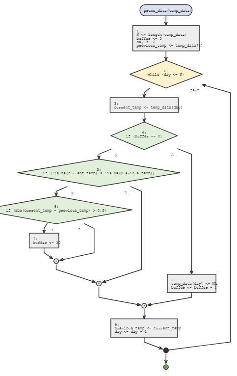
I have been meaning to try out the flow package as it appears to help people visualize loops and conditional statements. Here is some code that I made to help someone over in the R4DS Slack channel. The task was to check if the change in temperature was over 0.5, and then to set the next 30 days of data to NA. temp_data <- rnorm(100, 20, 1) #fake data about temperatures N <- length(temp_data) #initialization buffer <- 0 day <- 2 previous_temp <- temp_data[1] # loop while(day <= N){ current_temp <- temp_data[day] if(buffer == 0){ if(!

Continue reading

Drought Conditions

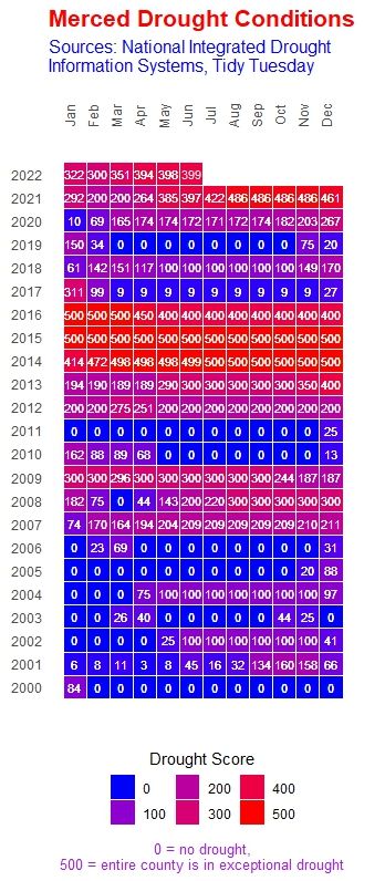
“The data this week comes from the National Integrated Drought Information System.” # load raw data # drought <- readr::read_csv('https://raw.githubusercontent.com/rfordatascience/tidytuesday/master/data/2022/2022-06-14/drought.csv') # drought_fips <- readr::read_csv('https://raw.githubusercontent.com/rfordatascience/tidytuesday/master/data/2022/2022-06-14/drought-fips.csv') # focus on subset of data # https://www.weather.gov/hnx/cafips # merced_df <- drought_fips |> # filter(FIPS == "06047") # since original data was a fairly large data file, let's # save a copy here to ease work # write_csv(merced_df, "merced_drought.csv") df_raw <- read_csv("merced_drought.csv") ## Rows: 1171 Columns: 4 ## ── Column specification ──────────────────────────────────────────────────────── ## Delimiter: "," ## chr (2): State, FIPS ## dbl (1): DSCI ## date (1): date ## ## ℹ Use `spec()` to retrieve the full column specification for this data.

Continue reading

TidyTuesday 20220607

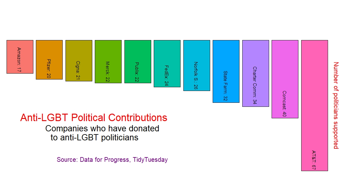
“The data this week comes from Data For Progress. “Each year, hundreds of corporations around the country participate in Pride, an annual celebration of the LGBTQ+ community’s history and progress. They present themselves as LGBTQ+ allies, but new research from Data for Progress finds that in between their yearly parade appearances, dozens of these corporations are giving to state politicians behind some of the most bigoted and harmful policies in over a decade.

Continue reading

Counting Political Mail

sender <- c("Steve Glaser", "Anna Caballero", "Esmeralda Soria", "Mike Karbassi", "Adam Gray", "CA Real Estate", "CFT", "misc") counts <- c(3, 3, 10, 6, 4, 4, 3, 1) df <- data.frame(sender, counts) df <- df |> mutate(for_label = paste0(sender, ": ", counts)) |> mutate(sender_ranked = forcats::fct_reorder(sender, counts)) df |> ggplot() + geom_bar(aes(x = counts, y = sender_ranked, fill = sender_ranked), stat = "identity") + geom_text(aes(x = counts, y = sender_ranked, label = for_label), hjust = "right", nudge_x = -0.

Continue reading