| June 14, 2022
“The data this week comes from the National Integrated Drought Information System.”
# load raw data
# drought <- readr::read_csv('https://raw.githubusercontent.com/rfordatascience/tidytuesday/master/data/2022/2022-06-14/drought.csv')
# drought_fips <- readr::read_csv('https://raw.githubusercontent.com/rfordatascience/tidytuesday/master/data/2022/2022-06-14/drought-fips.csv')
# focus on subset of data
# https://www.weather.gov/hnx/cafips
# merced_df <- drought_fips |>
# filter(FIPS == "06047")# since original data was a fairly large data file, let's
# save a copy here to ease work
# write_csv(merced_df, "merced_drought.csv")df_raw <- read_csv("merced_drought.csv")## Rows: 1171 Columns: 4
## ── Column specification ────────────────────────────────────────────────────────
## Delimiter: ","
## chr (2): State, FIPS
## dbl (1): DSCI
## date (1): date
##
## ℹ Use `spec()` to retrieve the full column specification for this data.
## ℹ Specify the column types or set `show_col_types = FALSE` to quiet this message.# data wrangling
df <- df_raw |>
separate(date, into = c("year", "month", "day"), sep = "-") |>
group_by(year, month) |>
mutate(avg_dsci = mean(DSCI, na.rm = TRUE)) |>
ungroup() |>
select(month, year, avg_dsci) |>
mutate_if(is.character, as.numeric)# data visualization
# ideas from https://mobile.twitter.com/XuehuaiH/status/1536623842310795265
my_plot <- df |>
ggplot(aes(x = month, y = year)) +
geom_tile(aes(fill = avg_dsci),
color = "white") +
coord_equal() + # for square tiles
geom_text(aes(x = month, y = year, label = round(avg_dsci)),
color = "white",
size = 3) +
guides(fill = guide_legend(title.position = "top")) +
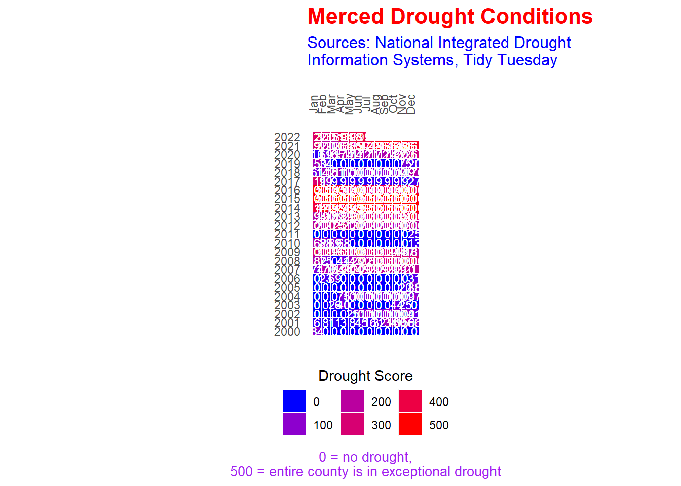
labs(title = "Merced Drought Conditions",
subtitle = "Sources: National Integrated Drought\nInformation Systems, Tidy Tuesday",
caption = "0 = no drought,\n500 = entire county is in exceptional drought",
x = "", y = "") +
scale_fill_gradient(low = "blue", high = "red",
name = "Drought Score") +
scale_x_continuous(breaks = 1:12,
labels = c("Jan", "Feb", "Mar", "Apr",
"May", "Jun", "Jul", "Aug",
"Sep", "Oct", "Nov", "Dec"),
position = "top") +
scale_y_continuous(breaks = 2000:2022,
labels = as.character(2000:2022)) +
theme(axis.text.x = element_text(angle = 90),
axis.text.y = element_text(hjust = 2),
axis.ticks = element_blank(),
legend.position = "bottom",
legend.title.align = 0.5,
panel.background = element_blank(),
plot.title = element_text(face = "bold", size = 16, color = "red"),
plot.subtitle = element_text(size = 12, color = "blue"),
plot.caption = element_text(size = 10, color = "purple", hjust = 0.5))# plot
my_plot